The Doomino Effect for the Week of April 4, 2007
Hello, you dotty-headed rows, and welcome to this week’s installment of The Doomino Effect. Let’s waste no time and get right to the stack.
 First off this week is Supergirl and the Legion of Superheroes #28 in which Supergirl, the Legion and the Wanderers pull the rug out from under the Dominators. I’m going to have to go back and re-read the past few issues to see if this surprise twist has any credibility or if it’s just Wild Things in a comic book (without the nudity).
This series, I have discovered, tends to get ripped to shreds by the fanboys on the internet, but I’ve always liked it. It tends to be most harshly criticized by those with a childhood fondness for previous incarnations of these future kids – a demographic to which I do not belong. As someone who one day, around issue #12 or #13, thought “I wonder what this is all about,” I can say it’s been one of the most consistently pleasing books I buy. But this big trap for the Dominators – I’m going to have to re-read. Because it’s awfully convenient, and there’s been an awful lot of bad stuff that’s happened in this war for Earth. So if this doesn’t hold water, then I might feel a bit exploited, and I might stop reading my favorite comic book starring somewhere around 300 characters.
Speaking of feeling exploited and having a lot of main characters, that leads me to Justice League of America #7. This book is so blasted slow. I feel like I bought an over-priced summary of the last 6 issues and they’re still discussing the team line-up? For crying out loud! If someone would have told me “Hey, issue 7 will be more expensive than usual and they are still going to be re-hashing the melodramatic team-invitation scene that they’ve been milking since issue zero!” I would have said “No they’re not.” And I would have been wrong!
It’s issue 7! STOP inviting people into the League! Stop setting up parallels with past League moments so that your colorist can use faux-60s colored dots that failed to line up properly in order to continue driving home the point that this is a new era, yet it still has its parallels with the past or whatever stupid point you’re trying to make via colored dots! WE GET IT!! Or maybe I don’t even get it but I’m so tired of this contrived extra level of sentimentality that I don’t want to even try to get it! I don’t want any more invitations, I don’t want to see any more tables with photos of potential recruits lying scattered about and I’m really tired of having 18 different perspectives narrating my way through the book, especially when they can’t be bothered to put the last 5 pages in the right order.
I probably should have been excited by the cliffhanger at the end, but at this point, it probably means that next issue, they’re going to print out a polaroid of Karate Kid and use color-coded caption boxes to debate whether or not to invite him into the League.
Speaking of caption-based narration and Batman, that leads me to Detective Comics #831. It was a cute story peeking into the mind of Harley Quinn, but I have a major problem with this issue. Yeah, it’s Paul Dini, who can probably write any character in his sleep, but I felt like there was a major out-of-character moment for Batman here. Spoilers ahead, but Bruce Wayne – as an Arkham board member (why, really?) – votes against Harley’s release because he doesn’t buy that she’s better or that her willingness to help the Joker was just Stockholm Syndrome. Smart guy. As Batman, he can surely see that there’s more to being a super-villain.
So then as Batman, he sees Harley turn on Scarface and later learns that it’s because of her loyalty to the original. Then he decides, as Bruce Wayne, to change his vote on her release. If anything, her behavior shows that she continues to be infatuated with charismatic supervillains. This would have been a cute plot for a cartoon, but for the actual comic book, I expect much better. Especially from Paul Dini.
Which leads me to Madman #1. I had super-high expectations for this book, because I’m basically in a constant state of anticipation for more Madman material. I have to say I was a little bit disappointed in this issue, but at the same time, I’m not at all worried about this relaunch. This issue was a whole lot of catch-up from years of Madman material, and considering how long it’s been since there was any stream of new, relevant Madman comics, that’s completely understandable.
A “Who am I? What am I?” story is completely acceptable for a Madman comic, since that’s been an undercurrent from day 1. But stories like that have the potential to become every pretentious thing that Madman has triumphantly not been, and I felt like this introduction balanced that line pretty carefully (whereas I’d like to see it confidently stomping on the fun side).
I’m quite aware of my position as the cranky old-time fan who knows how he likes his Madman and curses any changes or progression. I realize Allred probably has places to go and things to do with this character he’s nurtured for so long. I have enough faith in the guy’s genius to not be worried about the questions he’s raising.
And speaking of questions, that leads me to 52: Week 48. Gosh, do I hate Darick Robertson’s art. Is he trying to be Mark Texeira now? It’s just so dirty. And in case Mr Robertson reads the blog, let me offer you a bit of illustration advice – don’t draw every tooth. When you put a black line around every tooth in a person’s mouth – particularly the thick, messy black lines you use – it makes it look like they have giant gaps in their teeth. You do not need to draw every tooth. Please examine every other comic book illustrator for examples. There are plenty of other realms in which to tread your own stylistic path. Making all of your characters look like they need braces is not a good one.
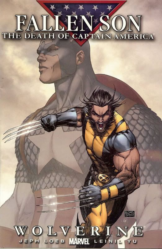 Speaking of crappy art with lots of lines, that leads me to Fallen Son: Wolverine. My goodness. What is the deal with Michael Turner? We can’t be the only four comic book readers on earth who think he sucks. Look at Wolverine! Not only are his biceps bigger than his head, which I suppose is acceptable in comic land, but just look at the guy – Turner has drawn him like a tall skinny person (with big muscles). He has drawn the same head that he puts on every other over-muscled body, except he put sideburns and messy hair on this one and through Michael Turner magic it’s Wolverine! Except it’s not. It’s just another really awful Michael Turner cover that blows my mind in a bad way.
Other than that greeting turd, I loved this book. Leinil Yu is one of my absolute favorites and this book is a fine showcase of his skills. That double-splash page with Wolverine and Daredevil is simply amazing. The story was fantastic in its characterization of everyone involved and just another example of how well Marvel is handling the post-Civil War restructuring of its universe.
The big, BIG problem I had with this issue is that the New Avengers – including Wolverine – in a book that Yu drew – are in the middle of an invasion of the Helicarrier – courtesy of Doctor Strange’s cloaking – in which they want to find out if Captain America is truly dead. Did Yu not stop to think “Hey, aren’t I illustrating this story twice?” Did Wolverine forget he was there once already? Did he just not bother to tell anyone what he saw? Did Doctor Strange stop to think “Hmm, didn’t I just do this? And if it’s so exhausting to do this with two people, how did I cover the whole New Avengers team?”
Stuff like this doesn’t ruin a great issue for me, but it does hurt the experience when I’m sitting and thinking “Dang, that was an awesome issue.” I can see contradictory overlaps like this happening with a minor book, but considering the conference room kitchen that Marvel is using to cook up the Civil War and post-Civil War stories, it’s hard to imagine how this didn’t get noticed. But using this series to cover the stages of grief is an interesting idea, and when this comes out as a trade eventually, I imagine it will be quite awesome and quite un-hindered by what happened in New Avengers.
JLoA #7 is probably the most boring issue thus far of 2007.